

AR feature: user flow and guidelines for retail mobile app
AR feature: user flow and guidelines for retail mobile app
Role
UX/UI Designer
Industry
Tech & AR
Duration
4 months
Scandit is a leading provider of mobile computer vision and augmented reality solutions, transforming how businesses and consumers interact with the physical world by offering advanced barcode scanning, text recognition (OCR), and object recognition technologies that enhance efficiency, reduce costs, and improve customer experiences across industries such as retail, logistics, healthcare, and manufacturing.
Project Overview
The project aimed to enhance the retail shopping experience by introducing dynamic, 3D AR overlays that inform and guide customers about promotions efficiently. We focused on developing an AR system that uses proximity-based information display to streamline the user experience in a retail setting.
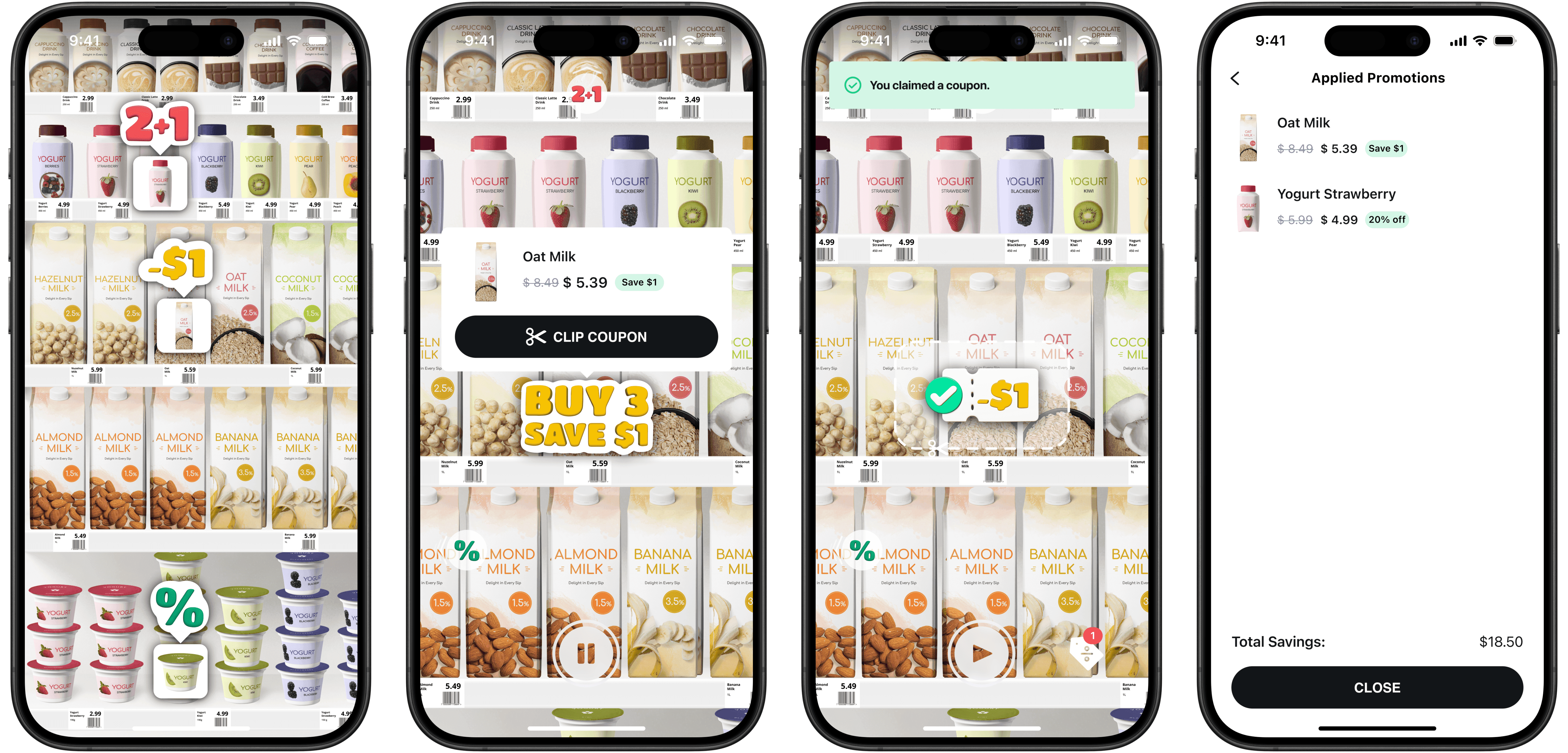


Final user flow
Challenges and Strategy
One of the initial challenges was designing an interface that could effectively balance information visibility without overwhelming the user. Given my prior experience with similar functionalities, I knew the approximate user flow needed improvement. The objective was to create a user-friendly yet informative environment.
The Problem: Retailers face challenges in communicating personalized promotions due to the high number of promotions spread across categories. Shoppers are often offered generic promotions that may not resonate with their individual preferences, making it difficult to discover relevant deals. Traditional coupon-based promotions are vague and underutilized as they require finding products and matching them to specific coupons.
The Goal: Create visually appealing 3D icons and clear animations that effectively demonstrate product functionalities, making it easy for users to understand and interact with Scandit’s AR solutions. Additionally, develop comprehensive guidelines for displaying and moving these icons within the app.
Designing the First 3D Overlay
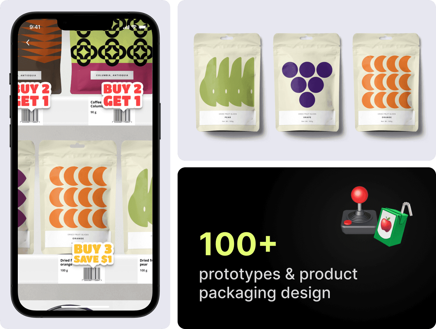
I began with the design of a 3D overlay for the "Buy 2 get 1 free" promotion, the most text-heavy option, using Nomad Sculpt due to its user-friendly interface on the iPad. This initial design helped test the overlay in a real-world-sized user flow, ensuring the design was adaptable for subsequent modifications.
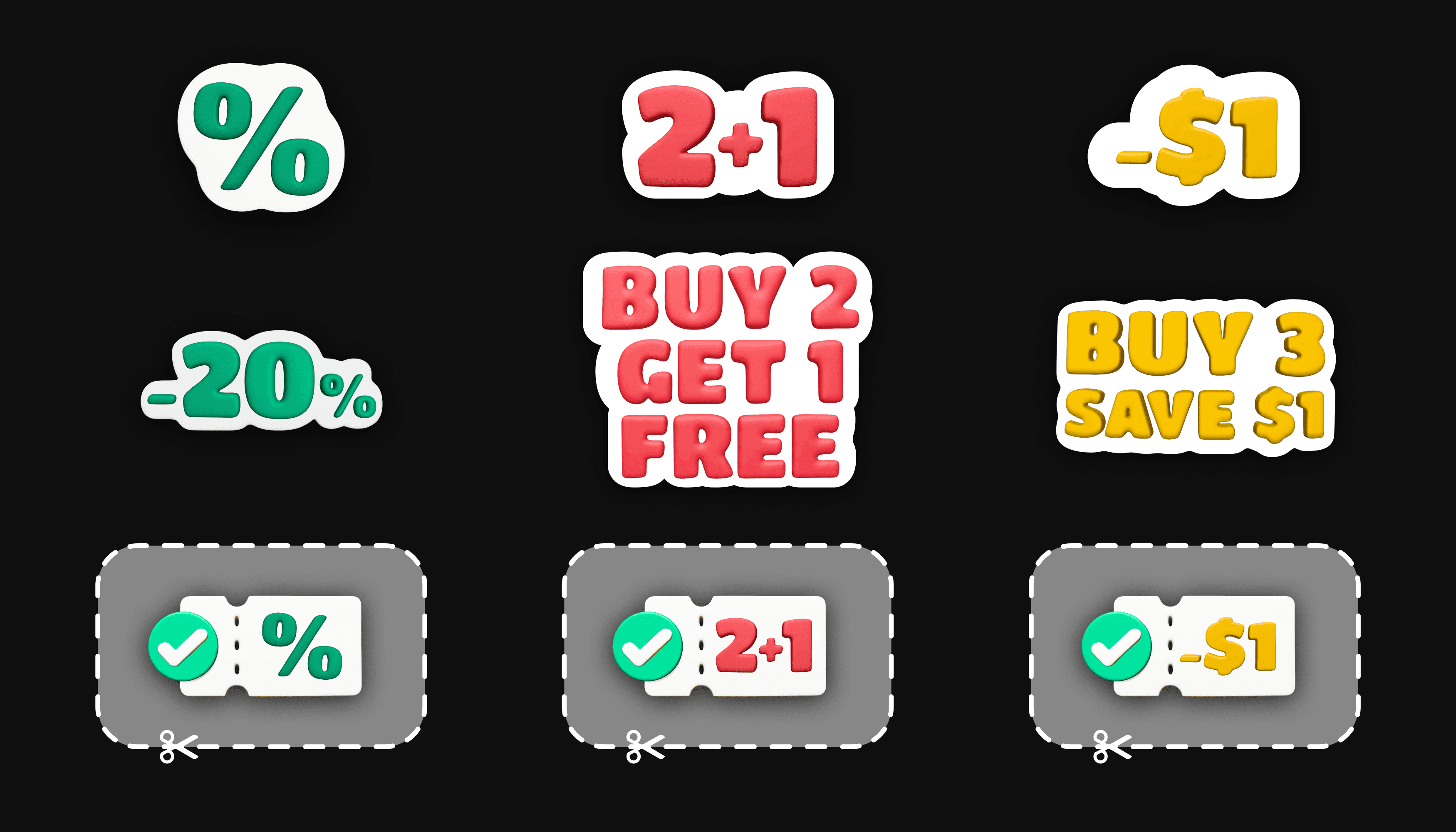


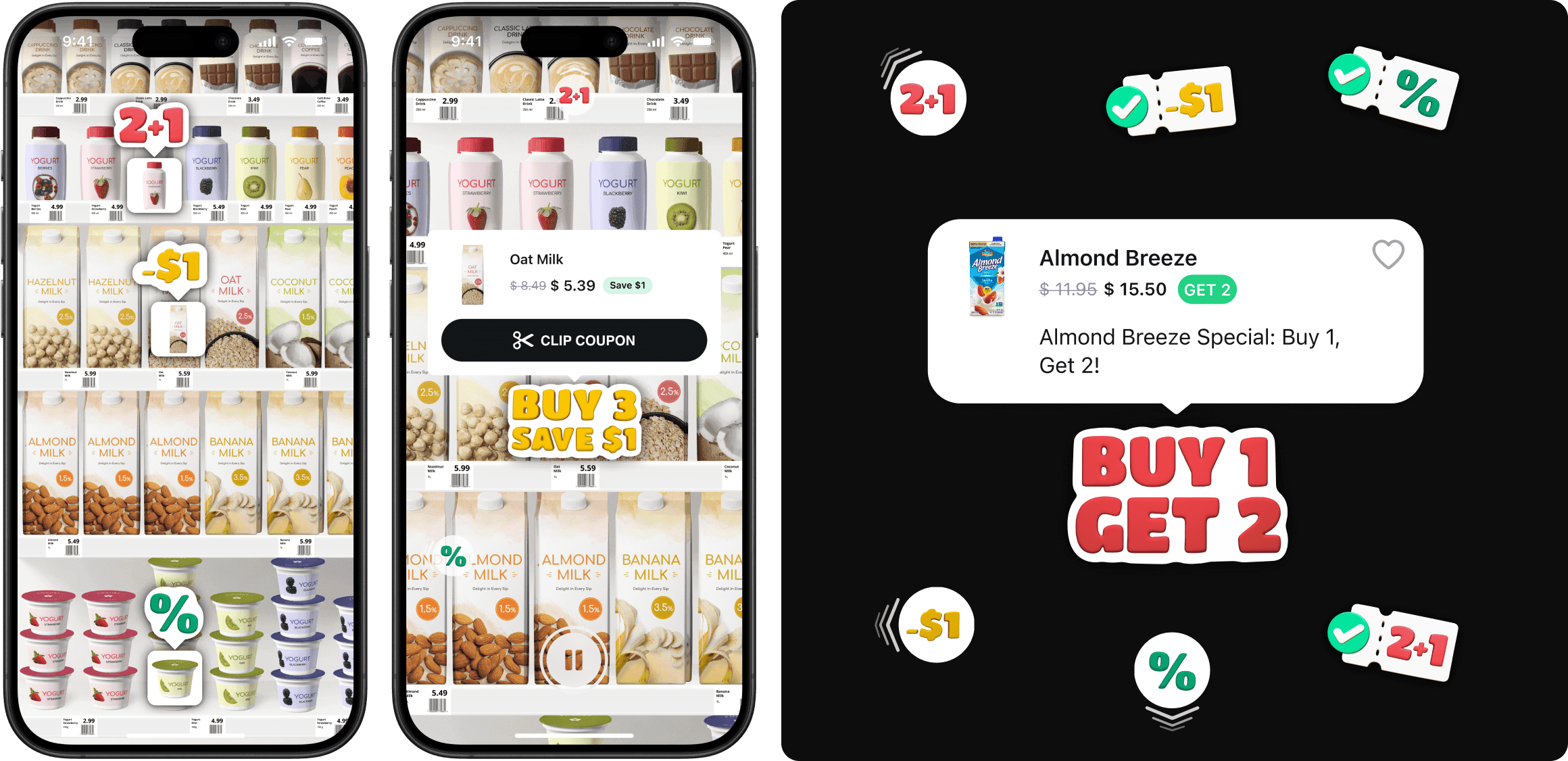
Spoiler: The final look of promo codes depending on the user's distance from the item.

Spoiler: The final look of promo codes depending on the user's distance from the item.
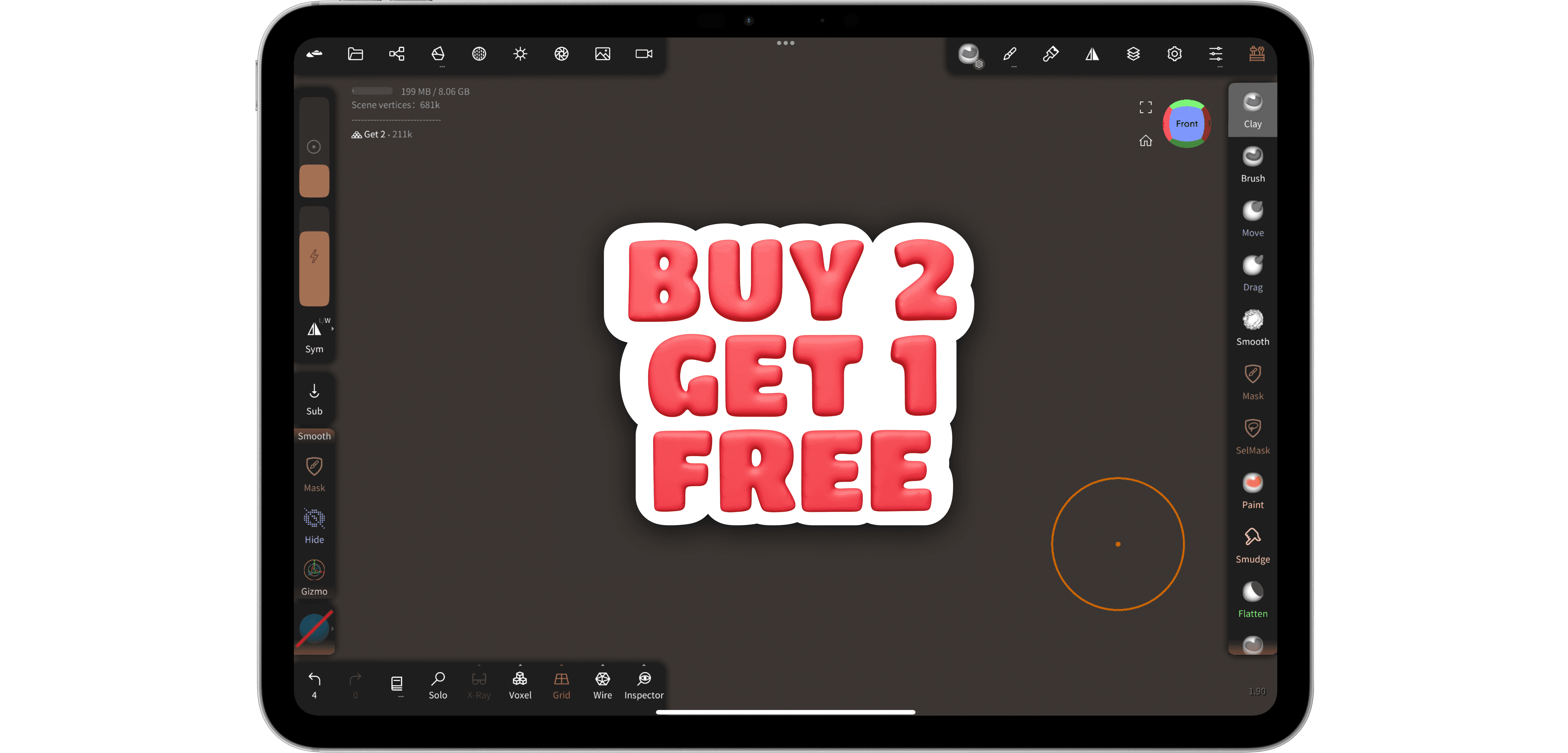


Process: design of a 3D overlay for the "Buy 2 get 1 free"
Iterative Design Improvements
To address the space issue, I developed designs for mini-icons that condensed the text (e.g., from "Buy 2 get 1 free" to "2+1") and implemented these as mini 3D icons. This allowed for a scalable display where smaller icons provided a general overview, and larger, more detailed icons appeared as users approached the promotions.
Integration and Prototyping
After the initial 3D design was completed, it was integrated into the current interface, and prototypes were developed using Figma. These prototypes helped identify that the promotional icons occupied excessive screen space, particularly when users moved away from the product shelves to view all promotions.
Enhanced User Interaction
We also noticed that it wasn't always clear which product a promotion referred to. To improve clarity, we added an interactive element that, upon tapping, would display detailed information about the product related to the promotion, including the discount amount, the original price, and an option to save the coupon for use at checkout. Additionally, an image of the product was added to help users better understand what the promotion was related to.
This is one of the first prototypes I created to determine the overall user flow from the moment they start using the AR coupon feature to the point where they clip a coupon and view applied coupons:
Feedback and Gamification
For already saved coupons, I designed a distinct icon to provide visual feedback that the coupon had been used, supporting a gamified experience where users collect savings as they shop. All used coupons were displayed under "Applied Promotions," along with the total savings accumulated.
Behavioral Guidelines for Promotional Icons
I established guidelines for the behavior of promotional icons, outlining areas on the phone screen where icons would move based on the physical location of promoted products. Additionally, animations were developed to attract user attention, though testing revealed that moving icons cluttered the interface, leading to a decision to keep them static relative to product placement. We also added overlays with arrows that indicate the direction (and also engage the user) of the promotion if it is off the device's screen.


The final flow
Outcomes and Impact
The new AR overlay system proved to be a significant improvement over traditional methods. Users reported a 70% usability satisfaction rate, indicating that the overlays made locating and understanding promotions easier and faster. The dynamic adjustment of the overlays based on user proximity was particularly praised for keeping the interface clean yet informative.
Here is the final flow:
Technologies and Tools Used
Nomad Sculpt: For 3D design work on the iPad.
Figma: For prototyping and integrating user flow designs.
Protopie: For animation and micro interactions.
ARKit: Used by developers for the deployment of AR overlays within the retail space.
Future Directions
Moving forward, the project will focus on expanding the variety of interactive promotional displays and improving the precision of overlay alignment with real-time product positioning adjustments, exploring more advanced AR capabilities and machine learning for a fully interactive retail environment.
